The digital storefront has become the main street for businesses across the United Kingdom, and in this bustling marketplace, visual appeal is the silent salesperson working tirelessly to attract and convert customers. In the highly competitive UK online market, a visually stunning e-commerce website is no longer a luxury but a fundamental requirement for success. For businesses striving to make their mark in regions as diverse as Bedfordshire and the vibrant heart of London, the first impression your website makes can be the difference between a browsing visitor and a loyal customer.

Many business owners, however, understandably find the prospect of creating an effective online store a daunting task. Navigating the complexities of design choices, technical hurdles, and the constant pressure to turn website traffic into tangible sales can feel overwhelming. Drawing upon over 15 years immersed in the IT sector, I have witnessed firsthand the evolution of e-commerce and the challenges that businesses face. This guide aims to demystify the process, offering clear insights and practical advice to help you craft an e-commerce website that is not only beautiful but also a powerful engine for growth.
The visual appeal of an e-commerce site directly impacts a visitor’s trust and their inclination to make a purchase. Think of your website as your shop window; a cluttered or poorly designed window is unlikely to entice passersby to step inside, regardless of the quality of the goods on offer. Similarly, in the online realm, users often subconsciously equate the professionalism and polish of a website with the credibility and trustworthiness of the underlying business. A visually appealing site signals attention to detail, a commitment to quality, and a sense of professionalism that makes potential customers feel more secure and comfortable when considering a transaction. Conversely, a website that appears outdated, disorganized, or difficult to navigate can immediately deter potential customers, no matter how exceptional your products might be.
However, focusing solely on aesthetics is not enough. While a visually striking design is crucial for capturing initial attention, the true power of an e-commerce website lies in its ability to seamlessly guide users through the purchasing journey. The design must also prioritize user experience and overall functionality to effectively drive conversions. A beautiful website that is cumbersome to navigate, slow to load, or confusing to use will inevitably frustrate visitors, leading to high bounce rates and ultimately, lost sales. Therefore, the key to successful e-commerce design is finding the perfect harmony between visual appeal and intuitive usability, ensuring that your online store not only looks inviting but also provides a smooth and efficient path from product discovery to completed purchase.
Website and Ecommerce Design Inspiration: Showcasing Beautiful UK E-commerce Websites
To provide tangible inspiration, let’s explore some design examples of visually stunning and user-friendly e-commerce websites hailing from the UK. These sites demonstrate various approaches to design, branding, and user experience, offering valuable lessons for businesses in Bedfordshire, London, and beyond. Many of these websites utilize design templates to streamline the creation process and ensure a cohesive look. These websites have chosen effective ecommerce solutions to enhance their design and user experience.
Copper & Brass: This online store for paper goods, including notebooks and stickers featuring illustrations of Black people, launched with a clear purpose: representation. The strong branding, evident in the product designs, shines through on their e-commerce platform. The integration of such a distinct brand identity into the website design creates a compelling reason for customers to buy, fostering an emotional connection that extends beyond the functional aspect of the products. Copper & Brass also offers coffee cups as part of their product range, complementing their bold and distinctive brand identity. Their website is fully customizable, allowing them to maintain a unique and consistent brand identity. When a brand’s core values are visually communicated through design, it resonates deeply with customers who share those values, leading to increased loyalty and a stronger purchase intent.
Vivi et Margot: This French homeware brand exemplifies the power of photography. Their website is rich with lifestyle photos set in the French countryside, creating a romantic and aspirational brand experience. Their impressive social media following, with over 156,000 followers on Instagram alone, speaks volumes about the persuasive power of their imagery. High-quality, evocative photography serves as a potent tool for crafting a strong brand experience and driving user engagement, particularly when lifestyle imagery aligns with the target audience’s desires and aspirations. These types of photos allow customers to envision the products seamlessly integrating into their own lives, thereby amplifying the desire to make a purchase. Vivi et Margot might have used the best ecommerce website builder to create their visually appealing and functional site. The substantial social media presence further acts as powerful social proof, validating the brand’s appeal and desirability.
These examples collectively illustrate that successful e-commerce website design in the UK is multifaceted. It involves a deep understanding of the target audience, a commitment to high-quality visuals, a focus on creating a seamless and enjoyable user experience, and an increasing awareness of current design trends and ethical considerations. These examples represent some of the best ecommerce websites in the UK.
Key Principles of Beautiful and High-Converting Ecommerce Website Design
Building a beautiful e-commerce website that also effectively converts visitors into paying customers requires a solid foundation of key design principles. These principles, when thoughtfully applied, can transform a basic online store into a thriving digital business.
User Experience (UX) First: At the heart of any successful e-commerce website lies a focus on the user experience. This means ensuring that your website is not only visually appealing but also incredibly easy and intuitive to use. Customers should be able to navigate your site effortlessly, quickly find the products they are looking for, and complete their purchases without any unnecessary hassle. A clear and logical site structure is paramount, organizing your content into easily understandable categories and subcategories. Implementing a prominent and efficient search bar, ideally with advanced filters, will further empower users to locate specific items within your product range. Perhaps most critically, the checkout process must be streamlined and simplified to minimize the number of steps required for completion, thereby significantly reducing the likelihood of cart abandonment. A frictionless user experience is absolutely essential for driving conversions. Customers expect a smooth and efficient journey from the moment they land on your site to the final confirmation of their order. Any point of friction or confusion along this path can lead to frustration and ultimately, the loss of a potential sale. A great ecommerce website design enhances the user experience by making the site visually appealing and easy to navigate, which is crucial for retaining customers and driving sales. Focusing on customer experience is crucial for ensuring that visitors have a positive interaction with the site.

Visually Engaging User Interface (UI): While user experience focuses on functionality, the user interface is all about how your website looks and feels. A visually engaging UI is crucial for capturing the attention of your audience and creating a positive first impression. Modern and well-organized layouts, complemented by consistent design elements, contribute to a professional and trustworthy appearance. The effective use of white space is also key, preventing your website from feeling cluttered and allowing users to focus on the most important content. Showcasing your products through high-quality images and videos is essential, as these visuals allow customers to see the details and envision themselves using your offerings. Maintaining a consistent brand identity across your entire website, through the strategic use of color palettes, typography, and imagery, will further strengthen brand recognition and build trust with your customers. Visual appeal is what initially draws visitors in, and a consistent and well-executed design instills confidence and encourages further exploration of your online store. Design ecommerce with a focus on creating a memorable user experience by incorporating various design styles and elements that enhance the customer journey. Incorporating various design tips can enhance the visual appeal and functionality of the website.
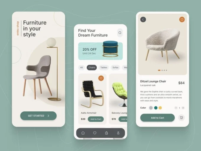
Mobile-First and Responsive Design: In today’s digital landscape, a significant portion of online shopping occurs on mobile devices, making a mobile-first approach absolutely essential. Designing your website with mobile users as the priority ensures that the experience is optimized for smaller screens, focusing on usability and performance on smartphones and tablets. Implementing responsive design principles is equally crucial, as this allows your website to automatically adapt its layout and content to fit seamlessly across a wide range of devices and screen sizes. This includes optimizing for touch-friendly navigation, ensuring that buttons and links are easily tappable, and striving for fast loading times, which are particularly critical for mobile users who may be browsing on slower connections. With the vast majority of internet users now accessing the web via mobile devices, prioritizing a mobile-first strategy is no longer just an option but a fundamental requirement for reaching a broad audience and providing a positive shopping experience. A responsive design ensures that all users, regardless of the device they are using, will have an optimal and consistent experience on your e-commerce site. A seamless shopping experience is crucial for mobile users, as it ensures they can navigate and purchase products effortlessly on their devices.
High-Quality Imagery and Video: When it comes to showcasing your products online, visuals are paramount. Since online shoppers lack the ability to physically touch or examine items before purchasing, high-quality imagery and video play a crucial role in conveying their appeal and detail. Using clear and detailed product images from multiple angles allows customers to see the features and craftsmanship of your offerings. Incorporating lifestyle images can further enhance the shopping experience by helping customers visualize how the products might look and function in their own lives. Additionally, consider utilizing product videos to provide a more dynamic and informative view, showcasing the product in action or highlighting key features. Investing in professional photography and videography can significantly impact your e-commerce success, as these visuals can effectively bridge the gap between the online and in-store shopping experience, providing the necessary information and inspiration for customers to make informed purchase decisions.
Strategic Use of Typography and Color: Typography and color are fundamental elements of visual communication and play a significant role in shaping your brand identity and the overall aesthetic of your e-commerce website. Choosing readable and visually appealing fonts and maintaining a consistent typographic hierarchy will ensure that your content is easy to digest and understand. Selecting a color palette that aligns with your brand’s personality and evokes the desired emotions is equally important in creating a cohesive and impactful visual experience. Furthermore, using color strategically to highlight calls to action and draw attention to important information can significantly improve user engagement and guide them through the purchasing process. Consistent and thoughtful application of typography and color not only enhances the visual appeal of your website but also reinforces brand recognition and contributes to a positive and trustworthy user experience.
Clear Calls to Action (CTAs): Calls to action are the prompts that guide your website visitors towards making a purchase or taking other desired actions. Clear and compelling CTAs are absolutely essential for guiding users through the sales funnel and driving conversions. Make your CTAs prominent and easily noticeable, using action-oriented language such as “Shop Now,” “Add to Cart,” or “Buy Now”. Ensure that these buttons or links are visually distinct from other elements on the page and are easy to click, especially on mobile devices with touchscreens. Strategically place your CTAs throughout your website, particularly on product pages, category pages, and your homepage, making it clear to users what steps they should take next. Without clear and concise instructions on how to proceed, potential customers may become uncertain or disengaged, leading to missed opportunities for sales.
Building Trust and Credibility: In the online world, where customers cannot physically interact with your business or products, building trust and credibility is paramount for e-commerce success. One of the most effective ways to achieve this is by prominently displaying customer reviews and testimonials on your product pages and throughout your website. Seeing positive feedback from other shoppers can significantly increase confidence in your products and your business. Additionally, displaying security badges and trust seals, especially on checkout pages, can reassure customers about the safety and security of their transactions. Providing clear and easily accessible information about your shipping policies, return procedures, and privacy practices further contributes to transparency and helps alleviate any concerns potential buyers might have. By actively building trust through these elements, you can create a more secure and comfortable shopping environment, encouraging visitors to complete their purchases. Choosing the right ecommerce solution is also crucial for building trust and credibility, as it ensures your site is reliable, secure, and capable of providing a seamless shopping experience.
Staying Ahead: Exploring Current Ecommerce Website Design Trends in the UK
The landscape of e-commerce website design is constantly evolving, with new trends emerging each year. Staying informed about these trends can help your website remain fresh, modern, and competitive in the UK market. For 2024-2025, several key design trends are shaping the way online stores are being created.
Minimalist Aesthetics: A prominent trend is the move towards minimalist design, characterized by clean layouts, ample white space, and a focus on essential elements and core functionality. This approach emphasizes purpose-driven design, ensuring that every element on the page serves a clear function. One of the key benefits of minimalism is faster loading times, as websites with fewer graphics and streamlined code tend to perform better, particularly on mobile devices. This not only enhances the user experience but can also positively impact your website’s search engine rankings. By reducing visual distractions, minimalist design allows your products to take center stage, potentially improving user focus and increasing conversion rates. In a visually saturated online environment, simplicity can be a refreshing and highly effective way to stand out. Modern design trends are also shaping ecommerce websites by integrating practical features that enhance usability and customer engagement.
Mobile-First and Responsive Design: With the rising prevalence of mobile commerce, optimizing for mobile devices is essential to enhance user experience and drive sales. A mobile-first design ensures that your website is responsive and user-friendly, catering to users shopping on mobile devices.
AI-Powered Personalization: Artificial intelligence is increasingly being integrated into e-commerce design to create more tailored and engaging shopping experiences. This includes the use of AI for intelligent product suggestions, which analyzes user behavior and preferences to recommend relevant items. Dynamic content adjustments allow websites to adapt the information displayed based on individual visitor profiles. Smarter chatbots, powered by AI, are also becoming more prevalent, offering 24/7 customer support, answering questions, and guiding users to the appropriate products or services. This trend towards hyper-personalization aims to create shopping experiences as unique as each customer, fostering a sense of being understood and catered to. Ultimately, personalization helps build customer loyalty and encourages repeat business, as customers feel more connected to brands that recognize and address their individual needs. AI-powered chatbots also improve the efficiency of customer service, providing instant assistance and freeing up human agents to handle more complex inquiries. Ecommerce website builders are incorporating AI to enhance personalization, making it easier for businesses to create unique and engaging shopping experiences. Additionally, third party apps can be used to integrate AI features and enhance personalization.
Dark Mode and Accessibility-First Design: User expectations around web accessibility and interface design have evolved significantly. Dark mode, once a niche feature, has become a popular user preference, particularly for mobile browsing in low-light conditions. Offering a dark mode option can reduce eye strain and even enhance battery life on devices with OLED screens. Simultaneously, there is a growing emphasis on accessibility-first design, ensuring that e-commerce websites are usable by everyone, including individuals with disabilities. This includes features such as screen reader compatibility and text alternatives for images. Prioritizing accessibility not only demonstrates inclusivity but can also expand your potential audience and even positively influence your website’s SEO, as search engines increasingly favor accessible websites. Providing options for visual comfort, such as dark mode, enhances overall user satisfaction, while designing with accessibility in mind ensures that a broader range of users can effectively interact with your online store.
Microinteractions and Motion UI: Subtle animations and feedback mechanisms, known as microinteractions, are becoming increasingly important in e-commerce design. These small touches, such as a button changing color when clicked or a subtle animation confirming an action, guide users through the website and provide immediate feedback on their actions. Motion UI involves using more significant animations to create interactive storytelling experiences. Microinteractions make the user interface feel more responsive and intuitive, enhancing the overall user experience and encouraging longer engagement with the website. These subtle cues and animations can make interactions feel more natural and satisfying, ultimately contributing to a more positive and user-friendly online shopping experience.
3D and Immersive Elements: Immersive technologies like 3D and augmented reality are starting to play a more significant role in e-commerce. 3D product visuals allow customers to see products from multiple angles, zoom in on details, and even view them in action through 360-degree videos. Augmented reality (AR) takes this a step further, enabling shoppers to virtually place products in their own living spaces before making a purchase or even try on clothing and accessories using their device’s camera. These immersive elements can significantly enhance the online shopping experience, bridging the gap between the physical and digital worlds and providing a more realistic and engaging way for customers to interact with products. This can lead to increased purchase confidence and potentially reduce the number of returns. These trends are particularly effective for showcasing digital products, providing a more interactive and engaging way to present items like ebooks, music files, and online courses. Additionally, using AI image editors to remove unwanted objects from product images can improve the overall visual quality and appeal of the website.
Sustainable and Eco-Friendly Design: With growing consumer awareness of environmental issues, sustainability is becoming an increasingly important factor in e-commerce design. This trend is reflected in website designs that incorporate green color palettes and nature-inspired graphics. Brands are also highlighting their sustainability certifications and offering eco-friendly shipping options, such as recycled packaging or carbon-neutral delivery. Showcasing your brand’s commitment to environmental responsibility can attract and retain eco-conscious customers, building brand loyalty among a growing segment of the market. Creating a unique ecommerce website can help brands stand out in the market, emphasizing their commitment to sustainability and ethical values.
Bold and Experimental Typography: Typography has always been a crucial element of web design, but current trends are leaning towards bolder and more experimental approaches. This includes the use of oversized typography, bold and statement-making fonts, and even retro typography to create a unique visual impact. Designers are also experimenting with combining serif and sans-serif fonts to create high-contrast pairings and using kinetic typography with movement and animations to make text more dynamic and engaging. Creative and impactful typography can effectively capture attention, reinforce your brand’s personality, and enhance the visual hierarchy of your website’s content, making it more engaging and memorable for visitors.
Gradients and Color Transitions: Gradients have evolved beyond simple linear blends and are now being used in more complex and multi-dimensional ways to create immersive digital interfaces. Layered transitions, often blending purples, pinks, and blues, are used to simulate movement and interactivity, adding depth and visual interest to the design. This technique can create a more dynamic and modern feel for your website, enhancing the overall user experience.
Animated Product Reveals: Instead of static product images, some e-commerce websites are now using animated product reveals to display their offerings in motion. These computer-generated videos can bring any visual to life, adding a dynamic and engaging element to product listings. This approach can help online shoppers visualize the products they are considering purchasing in a more realistic and compelling way, potentially making the online shopping experience more memorable and increasing conversion rates.
Multidirectional Layouts: Traditionally, e-commerce websites have followed a linear, vertical scrolling layout. However, a newer trend is the use of multidirectional layouts that allow shoppers to scroll diagonally, left-to-right, or in other directions, not just up and down. This unconventional approach can make it easier for shoppers to compare products side-by-side and can also be optimized for multiple languages, including right-to-left languages. Implementing a multidirectional layout can help your e-commerce brand stand out from competitors and present your products in a more innovative and engaging manner.
These trends, along with evolving preferences in typography, imagery, and color palettes, highlight the dynamic nature of e-commerce website design. Staying informed and selectively incorporating these elements can help your UK-based e-commerce business create a website that is not only beautiful but also effective in attracting and converting customers in the ever-competitive online marketplace.
Avoiding Common Mistakes: Pitfalls to Watch Out For in Ecommerce Design
While striving for a beautiful e-commerce website, it’s equally important to be aware of common mistakes that can detract from its appeal and effectiveness. Avoiding these pitfalls can significantly improve the user experience and ultimately boost your conversion rates.
One frequent error is confusing or complex navigation that makes it difficult for users to find the products they are looking for. Ensuring a smooth transactional flow is crucial to avoid user frustration during the purchase process. Clearly defined product categories can enhance user experience by streamlining navigation and making it easier for customers to explore and identify products. Similarly, a website that is not mobile-friendly or lacks responsiveness across different devices can alienate a significant portion of your potential customers. An effective ecommerce store must be optimized for mobile devices to enhance the shopping experience. Providing insufficient or poor-quality product information and images can leave shoppers with unanswered questions and a lack of confidence in their purchase. A well-designed product page that effectively showcases the product can inspire sales by enhancing buyer confidence and engagement. An overly long or complicated checkout process is a major cause of cart abandonment, frustrating customers who are ready to buy. Slow loading times can also lead to high bounce rates, as impatient users are likely to leave a website that takes too long to load. Failing to provide clear contact information and readily accessible customer service options can erode trust and leave customers feeling unsupported. Ecommerce platforms that do not require coding skills can help businesses maintain clear and accessible contact information. The overuse of pop-ups can be highly disruptive and annoying to users, potentially driving them away from your site. Inconsistent branding and design elements across your website can create a disjointed and unprofessional impression. Neglecting SEO best practices will limit your website’s visibility in search engine results, making it harder for potential customers to find you. Finally, a lack of trust signals, such as security certificates and customer reviews, can make visitors hesitant to make a purchase. Displaying technical certifications can help build credibility and reduce shopping cart abandonment by instilling confidence in potential customers.
Many of these common pitfalls relate directly to poor user experience, technical shortcomings, and a failure to prioritize the needs and expectations of the customer. While a website might initially appear visually appealing, if it suffers from usability issues, slow performance, or a lack of trustworthiness, it will ultimately fail to convert visitors into loyal customers. Addressing these mistakes proactively is therefore crucial for creating an e-commerce website that is not only beautiful but also highly effective in achieving your business goals.
Actionable Tips for Creating Your Beautiful Ecommerce Website (with a nod to Bedfordshire and London)
Creating a beautiful and high-converting e-commerce website requires a strategic approach and attention to detail. Here are some actionable tips for businesses in the UK, including those in Bedfordshire and London, looking to design or redesign their online stores.
Begin by planning your user journey. Carefully map out the steps a customer will take from the moment they land on your website to the completion of their purchase. Ensure that this flow is smooth, intuitive, and free of any unnecessary obstacles. Effective ecommerce website designs can significantly enhance the customer journey by providing a seamless and engaging user experience. Invest in high-quality visuals. Utilize professional photography and videography to showcase your products in the best possible light, highlighting their features and benefits. Offering affordable prices can attract a wider audience and enhance the appeal of the products. The importance of catalogue management cannot be overstated in showcasing products effectively. Given the prevalence of mobile shopping in the UK, prioritize mobile-first design. Design your website with mobile devices as the primary focus, and then adapt the design for larger screens to ensure a seamless experience across all devices. Choose a consistent and brand-aligned design. Select a color palette, typography, and overall visual style that accurately reflects your brand’s personality and resonates with your target audience. Optimize for speed. Ensure that your website loads quickly by compressing images, minifying code, and choosing a reliable web hosting provider. Simplify navigation. Implement clear and concise menus, a prominent and functional search bar, and effective filtering options to help users easily find what they need. Streamline the checkout process. Minimize the number of steps required to complete a purchase and offer a variety of convenient payment options. Build trust with social proof and security. Clearly display customer reviews, testimonials, and security badges to reassure visitors about the legitimacy and safety of your online store. Showcasing positive experiences from other shoppers helps to encourage new customers to make a purchase. Provide excellent customer support. Make it easy for customers to contact you with any questions or issues they may encounter. Finally, test and iterate. Continuously monitor your website’s performance, gather user feedback, and make ongoing improvements to your design and functionality based on these insights and analytics. Creating an own store with a unique online retail presence can help businesses stand out and attract loyal customers. Continuously improving ecommerce website designs can lead to a better customer journey and higher conversion rates.
For businesses specifically located in Bedfordshire or London, consider partnering with local web design agencies that possess a deep understanding of the UK market and can help bring your unique vision to life. Look to successful e-commerce businesses within Bedfordshire and London for inspiration, carefully noting the design elements and user experience strategies that contribute to their online success. When targeting local customers in these regions, ensure that your website design and content reflect an understanding of the local market and potentially highlight any unique local aspects of your business, such as local sourcing or community involvement.
Conclusion: Investing in Beauty for Ecommerce Success
In the dynamic and competitive UK e-commerce landscape, a beautiful and thoughtfully designed website is not merely an aesthetic preference but a fundamental necessity for attracting customers, driving sales, and establishing a strong and lasting brand presence. Ecommerce businesses can benefit from investing in great design and effective ecommerce platforms tailored to their unique needs. By prioritizing the user experience, embracing current and relevant design trends, and diligently avoiding common pitfalls, businesses in Bedfordshire, London, and throughout the United Kingdom have the opportunity to create online stores that not only captivate and delight visitors but also serve as powerful engines for growth and long-term success. Established businesses can continue to grow by focusing on search engine optimization and modern design trends. Investing in the beauty and functionality of your e-commerce website is an investment in the future of your business in the digital age. Creating a user-friendly e-commerce experience is crucial for success in the competitive world of shopping online. This investment can help businesses grow from small operations to larger businesses with a nationwide or global reach.
Introduction to E-commerce
E-commerce, or electronic commerce, refers to the buying and selling of goods and services over the internet. In today’s digital age, it has become an essential part of the modern business landscape, with more and more people turning to online stores to purchase products and services. For any ecommerce business, having a well-designed ecommerce website is crucial. It serves as the primary platform where customers can browse and purchase products, and where businesses can showcase their brand and offerings.
A great ecommerce website incorporates several key elements that contribute to its success. These include an intuitive navigation system, high-quality images and videos, clear product descriptions, and a seamless checkout process. Showcasing physical products with high-quality images and clear descriptions is essential to enhance customer experience. Additionally, the website should be mobile-friendly, ensuring that customers can shop conveniently from their mobile devices. By focusing on these elements, businesses can create an engaging and user-friendly online store that attracts and retains customers.
Moreover, a well-designed ecommerce website not only enhances the shopping experience but also helps in building a strong brand presence. It allows businesses to effectively communicate their brand values and connect with their target audience. Offering gluten free products can appeal to health-conscious consumers and enhance the brand’s appeal. In a competitive market, having a visually appealing and functional ecommerce site can be a significant differentiator, driving more sales and fostering customer loyalty.
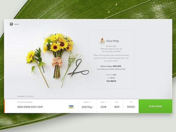
Creating a Great Checkout Experience
A great checkout experience is essential for any ecommerce website, as it can make or break a sale. The checkout process should be seamless, intuitive, and hassle-free, with clear and concise instructions and minimal distractions. When customers reach the checkout stage, they are ready to make a purchase, and any friction or confusion can lead to shopping cart abandonment.
To create a seamless checkout experience, it’s important to provide a range of payment gateways and shipping methods to cater to different customer needs. Offering multiple payment options, such as credit cards, PayPal, and other digital wallets, ensures that customers can choose their preferred method. Similarly, providing various shipping methods, including standard, expedited, and international shipping, allows customers to select the option that best suits their requirements. Additionally, free hosting can support high traffic volumes and enhance the overall shopping experience.
Including customer testimonials and trust badges on the checkout page can also help to build trust and increase conversions. Testimonials from satisfied customers provide social proof, reassuring potential buyers about the quality of the products and the reliability of the business. Trust badges, such as security certifications and money-back guarantees, further enhance the sense of security, making customers feel confident about completing their purchase. Highlighting cruelty free certifications can also appeal to ethically conscious consumers.
By following best practices in ecommerce web design and providing a great checkout experience, businesses can increase sales, reduce shopping cart abandonment, and build a loyal customer base. Offering customizable t shirts can enhance the product range and attract a diverse customer base. A well-designed checkout process not only improves the overall user experience but also contributes to the long-term success of the ecommerce business.
Building Trust with Customers
Building trust with customers is a crucial aspect of any ecommerce website. When a customer visits an ecommerce store for the first time, they may not know anything about the brand, products, or commitment to making customers happy. To establish trust, ecommerce businesses can incorporate several trust indicators that reassure potential customers about the reliability and integrity of the online store.
One effective strategy is to prominently display clear contact information, including phone numbers, email addresses, and physical addresses. This transparency makes it easy for customers to reach out with questions or concerns, fostering a sense of reliability. Additionally, having a well-defined return policy that is easily accessible can alleviate any apprehensions customers might have about making a purchase.
Customer testimonials and user-generated content are powerful tools for building credibility. Positive reviews and feedback from satisfied customers serve as social proof, demonstrating that others have had good experiences with the business. Featuring these testimonials on product pages and throughout the website can significantly boost potential customers’ confidence in the brand.
Security badges and trust seals are also essential for reassuring customers that their personal and payment information is secure. Displaying these badges, especially on checkout pages, can reduce anxiety about online transactions and increase the likelihood of completing a purchase.
By prioritizing trust and transparency, ecommerce businesses can create a loyal customer base and increase conversions. Trust is the foundation of any successful ecommerce website, and by implementing these strategies, businesses can build a strong and lasting relationship with their customers.
Creating a Visually Compelling Experience
Creating a visually compelling experience is essential for ecommerce websites to capture the attention of online shoppers and drive sales. A great ecommerce website design should include high-quality images, consistent branding, and a clear visual hierarchy that guides the user’s journey seamlessly.
High-quality images are a cornerstone of effective ecommerce website design. They allow customers to see the details of the products, making it easier for them to make informed purchasing decisions. Lifestyle photos, which show products in real-life settings, can be particularly effective in helping customers envision how the products might fit into their own lives.
Consistent branding across the website is also crucial. This includes using a cohesive color scheme, typography, and design elements that reflect the brand’s identity. Consistency in branding helps build recognition and trust, making the website feel professional and reliable.
A clear visual hierarchy is essential for guiding customers through the website. This involves using design elements such as whitespace, color schemes, and typography to create a modern and sleek design. Whitespace helps to prevent the website from feeling cluttered, allowing key elements to stand out. Strategic use of color can draw attention to important areas, such as call-to-action buttons, while a well-chosen typography ensures readability and enhances the overall aesthetic.
By incorporating these design elements, ecommerce businesses can create an immersive and engaging experience for their customers, ultimately driving more sales and revenue. A visually compelling ecommerce website not only attracts visitors but also keeps them engaged, encouraging them to explore and make purchases.
Mobile First Design Approach
A mobile-first design approach is critical for ecommerce websites to ensure a seamless shopping experience across all devices. With the majority of online shoppers using mobile devices to browse and purchase products, ecommerce businesses must prioritize mobile optimization to stay competitive.
A mobile-first design approach involves designing the website for mobile devices first and then adapting it for larger screens. This ensures that the website is optimized for smaller screens, with intuitive navigation, easy-to-use interfaces, and fast loading speeds. Mobile users expect a hassle-free experience, and a mobile-first design can significantly enhance their journey from browsing to checkout.
Intuitive navigation is a key component of mobile-first design. Menus should be simple and easy to access, with clear categories and subcategories that help users find what they are looking for quickly. Buttons and links should be large enough to tap easily, and forms should be streamlined to minimize the effort required to complete them.
Fast loading speeds are also crucial for mobile users, who may be browsing on slower connections. Optimizing images, minifying code, and using efficient hosting solutions can help ensure that the website loads quickly, reducing the likelihood of users abandoning the site due to slow performance.
By adopting a mobile-first design approach, ecommerce businesses can improve the customer journey, reduce shopping cart abandonment, and increase conversions. Additionally, a mobile-first design approach can also improve search engine optimization (SEO) and drive more traffic to the website. Search engines prioritize mobile-friendly websites, so optimizing for mobile can enhance visibility and attract more potential customers.
In today’s digital landscape, a mobile-first design approach is not just an option but a necessity for ecommerce success. By focusing on mobile optimization, businesses can provide a seamless and enjoyable shopping experience for all users, regardless of the device they are using.